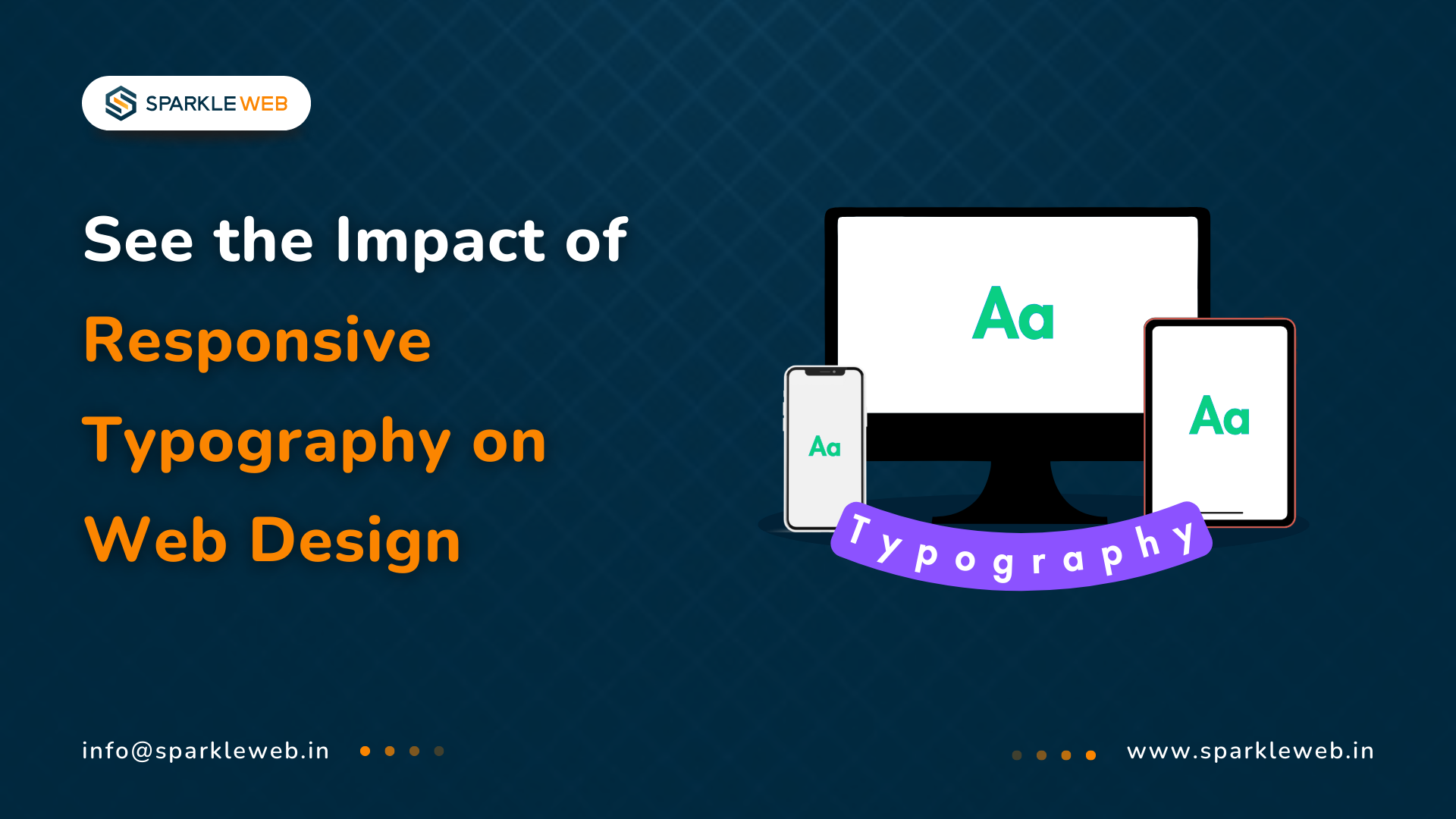
Typography means the style and look of the text on a website. It’s a very important part of web design because it helps people read your content easily, enjoy the experience, and remember your brand. Whether it’s a news article, a product page, or a personal blog, good typography makes a big difference.
Today, people use many different devices to browse the internet—smartphones, tablets, laptops, and large desktop screens. Because of this, the text on your website needs to adjust automatically to fit different screen sizes. This is where responsive typography comes in. It helps make sure your text always looks good and is easy to read, no matter what device someone is using.
In this blog, we will explain what responsive typography is, why it’s important, how you can use it on your website, and what challenges to keep in mind. We’ll also give real examples and simple tips so you can start improving your website’s typography today.
1. What is Responsive Typography?
Responsive typography means making sure the text on your website changes and adjusts smoothly based on the size of the screen. For example, the text should be bigger and more spread out on large desktop screens but smaller and tighter on a mobile phone.
This is done by using special settings in your website’s code, like CSS (Cascading Style Sheets). Instead of using a fixed font size (like always 16 pixels), responsive typography uses flexible sizes that can change when the screen size changes.
Key Aspects of Responsive Typography:
-
Fluid Sizing: This means the font size automatically gets bigger or smaller based on the width of the screen. For example, a headline might be 40 pixels on a laptop but only 24 pixels on a mobile phone.
-
Line Height & Spacing: It’s not just the font size that matters. The space between lines (called line height) and the space between letters (called letter spacing) also need to be adjusted to keep the text easy to read.
- Variable Fonts: These are smart font files that can change weight (boldness), width, and style without needing to load many different font files. This saves time and makes your website faster.
- Media Queries & CSS Techniques: These are parts of your website code that tell the browser how to change the typography when the screen size hits certain breakpoints (for example, when it’s smaller than 768 pixels wide).
2. Why Responsive Typography Matters
Let’s look at why responsive typography is so important in web design today.
a) Better Readability & Accessibility
If your text is too small or too big on a certain device, people will struggle to read it. Responsive typography makes sure the text size, spacing, and style always fit the screen, making it comfortable to read. This is especially helpful for people with vision problems because it keeps the contrast, size, and spacing at good levels.
b) Improved User Experience (UX)
A website that’s easy to read keeps people happy. Responsive typography helps users have a smooth and enjoyable experience, no matter what device they are using. It also reduces eye strain because the text is the right size and spaced well.
c) SEO Benefits
Did you know that Google gives better rankings to mobile-friendly websites? Responsive typography is a big part of making your site mobile-friendly. When people find your site easy to read and stay longer, it also helps improve your search engine ranking.
Good typography also helps search engines understand your content better because the text is organized with proper headings, paragraphs, and spacing.
3. Key Techniques for Implementing Responsive Typography
Now let’s break down how to actually add responsive typography to your website.
a) Using Relative Units
Instead of using fixed sizes (like 16px), you can use relative units that change based on different things:
b) CSS Clamp & Fluid Typography
The clamp() function is a smart way to make font sizes flexible between a minimum and maximum size. Here’s an example:
font-size: clamp(1rem, 2.5vw, 2rem);
This tells the browser:
c) Implementing Media Queries
Media queries let you change the typography when the screen size reaches certain points (called breakpoints). Here’s a simple example:
@media (max-width: 768px) {
  body {
    font-size: 1rem;
  }
}
This means: that when the screen is 768 pixels wide or smaller (like a tablet or phone), make the body text size 1rem.
d) Variable Fonts for Performance Optimization
With variable fonts, you can have multiple font weights (like regular, bold, and extra-bold) in one single font file. This makes your website load faster because it needs to load fewer font files.
Example:
font-family: 'InterVariable', sans-serif;
font-variation-settings: 'wght' 400;
e) Optimizing Line Height & Spacing
Good typography isn’t just about size. You also need to set the right line height and letter spacing to make the text easy to read.
Example:
line-height: 1.5;
letter-spacing: 0.02em;
4. Examples of Responsive Typography in Action
a) News Websites
Big news websites like BBC and The New York Times use responsive typography to make sure their articles are easy to read on both large computer screens and small phone screens.
b) E-commerce Stores
Brands like Nike and Apple use responsive typography to make sure that product details, prices, and buttons are clear and easy to click, no matter what device you are using.
c) Portfolio Websites
Designers and developers use responsive typography in their online portfolios so their work looks great on every device, from phones to big desktop monitors.
5. Challenges & Things to Watch Out For
Even though responsive typography is very helpful, there are a few challenges to keep in mind:
-
Font Load Time: Large font files can slow down your website. You can use settings like font-display: swap; to make sure the text shows up quickly, even if the custom font is still loading.
-
Cross-Browser Compatibility: Make sure to test your typography on different browsers like Chrome, Firefox, Safari, and Edge to be sure everything looks good.
- Contrast & Color Accessibility: Always check that your text has enough contrast (difference in color) with the background. This helps people read easily, even in bright sunlight or low light.
Conclusion
Responsive typography is no longer just a "nice-to-have"—it’s a must for modern web design. It helps your website look professional, keeps visitors happy, and improves your Google ranking.
Today, more than 73% of all web traffic comes from mobile devices (Statista, 2024). This means your website needs to be mobile-friendly, and typography plays a big part in that. According to Google’s UX report (2024), websites that are easy to read can see 60% higher user engagement and 50% longer visits.
By using flexible units, CSS techniques, and following the best practices we talked about, you can make your text look great on every screen. This will keep your users happy and coming back for more.
Is your website text fully responsive and ready for today’s users? At
Sparkle Web, we are experts in creating beautiful, easy-to-read web designs that work perfectly on all devices. Whether you’re updating your current site or building something new, our team is ready to help you make a website that is readable, accessible, and high-ranking.
Contact us today, and let’s make your website look amazing together!

Vikas Mishra
A highly skilled Angular & React Js Developer. Committed to delivering efficient, high-quality solutions by simplifying complex projects with technical expertise and innovative thinking.
Reply