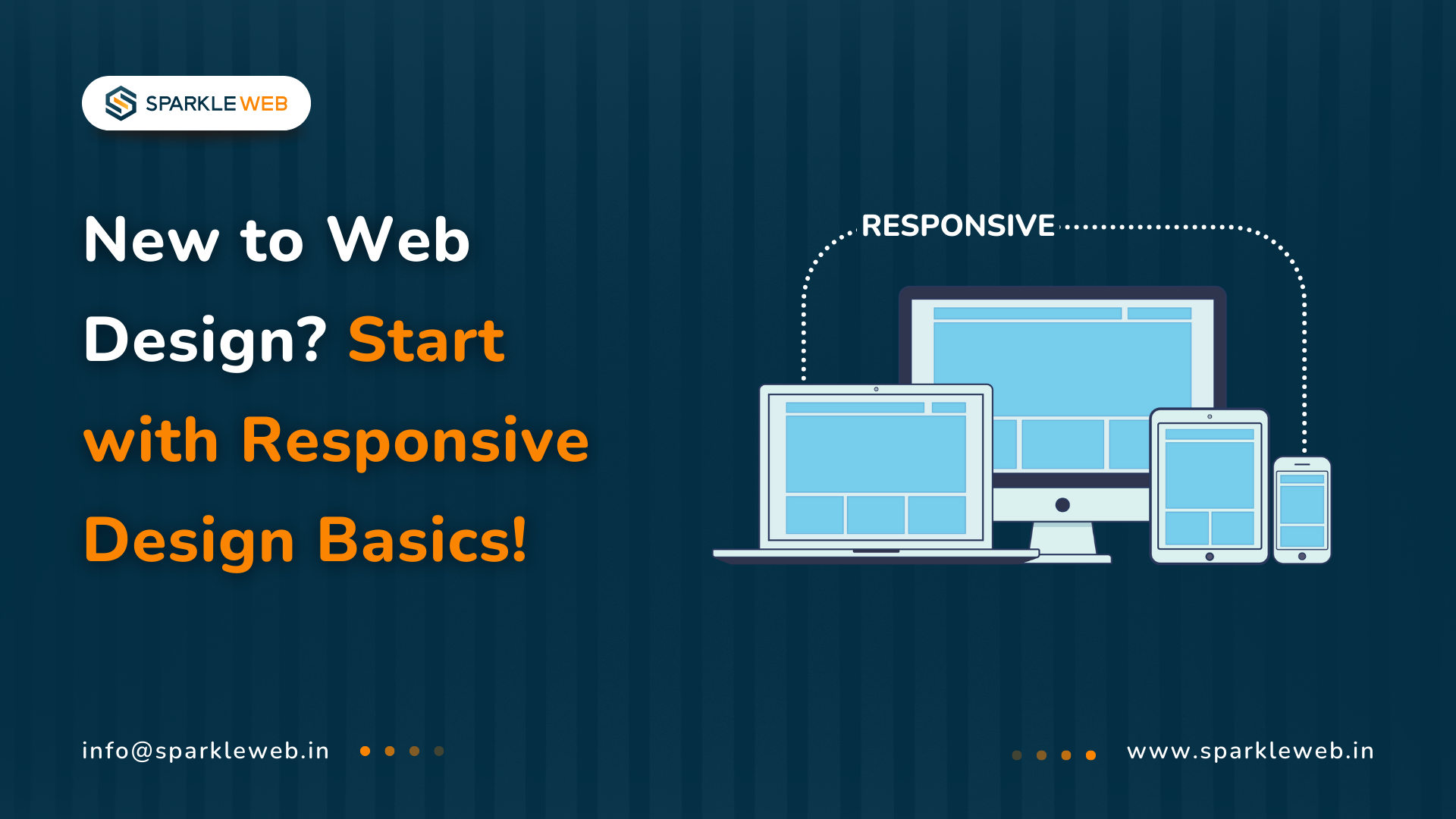
In today’s digital world, people use many different devices to visit websites. Some people browse on a desktop computer, some use a tablet, others use a smartphone, and some even use a smartwatch. All these devices have different screen sizes, and people expect the websites they visit to look good and work smoothly on all of them.
As a web developer or someone building a website, you must make sure your site adjusts and works well on any device. That’s where something called Responsive Web Design (often called RWD) helps you.
In this detailed guide, you will learn:
- Best practices and useful tips
What is Responsive Web Design?
Responsive Web Design is a way of designing and building websites so that they automatically adjust to fit the screen they are being viewed on.
Instead of building separate websites for desktop, mobile, or tablet users, responsive design helps you build one single website that works for all screen sizes.
Responsive websites:
- Keep everything in place even when the screen is very small or very wide
Important Parts of Responsive Web Design
To create a responsive website, you will use some basic techniques. Let’s look at them one by one:
1. Fluid Grids
In older web designs, developers used fixed pixel sizes (like width: 500px). However, in responsive design, we use fluid grids, which means using percentages instead of fixed sizes.
This helps elements like text boxes, images, or columns adjust their width based on the size of the screen.
Example in CSS:
.container {
  width: 100%;
  max-width: 1200px;
  margin: 0 auto;
  padding: 0 15px;
}

.column {
  width: 30%;
  float: left;
  margin-right: 3%;
}

.column:last-child {
  margin-right: 0;
}
2. Flexible Images
Images can look too large or get cut off on small screens. A responsive website uses CSS rules to make sure the images resize properly.
You can use:
img {
  max-width: 100%;
  height: auto;
}
3. Media Queries
Media queries are like rules in your CSS that tell the browser:
“If the screen is this size, then apply these styles.”
It’s like saying:
-
On mobile screens, use the small font and stacked layout
-
On tablets, adjust the spacing
- On desktops, show multiple columns
Example in CSS:
@media (min-width: 768px) {
  .container {
    padding: 0 30px;
  }
  .column {
    width: 48%;
  }
}

@media (min-width: 1024px) {
  .container {
    padding: 0 50px;
  }
  .column {
    width: 30%;
  }
}
This means:
-
When the screen is 768 pixels wide or more, update padding and layout
-
When the screen is 1024 pixels wide or more, use a multi-column layout
Why is Responsive Design Important?
Let’s look at the main reasons why responsive design is a must-have today:
1. Better Experience for Users
When your website adjusts nicely to all devices:
This gives visitors a smooth experience, no matter what device they are using.
2. Search Engine Benefits (SEO)
Google prefers websites that are mobile-friendly.
In fact, in 2024, more than 63% of Google search traffic came from mobile devices.
A responsive website:
-
Loads faster
-
Looks better on mobile
- Keeps users engaged
This helps your site rank higher in search results.
3. Saves Time and Money
Without responsive design, you would need:
-
One website for desktop
-
Another for mobile
- Another for tablets
That means more development time and extra maintenance work. With responsive design, you only need one site that works for all.
4. Faster Loading Speeds
Responsive websites are built with performance in mind.
If a website takes too long to load, people will leave. According to Google (2023), if your page load time increases from 1 second to 3 seconds, there is a 32% chance that the visitor will leave (bounce).
How to Create a Responsive Website
Let’s go step-by-step and see how to make your website responsive.
Step 1: Use a Fluid Grid Layout
Use percentages or viewport units like vw (viewport width) instead of px.
.container {
  width: 100%;
  max-width: 1200px;
  padding: 0 15px;
}

.column {
  width: 48%;
  float: left;
  margin-right: 4%;
}
This ensures your layout adjusts to the screen.
Step 2: Make Images Flexible
Add this CSS:
img {
  max-width: 100%;
  height: auto;
}
This makes sure your images resize properly within the space they are in.
Step 3: Use Media Queries for Different Screens
This is how you apply different styles for different devices.
@media (min-width: 768px) {
  .column {
    width: 48%;
  }
}

@media (min-width: 1024px) {
  .column {
    width: 30%;
  }
}
Start designing for mobile first, then add styles for larger screens.
Step 4: Test Your Website on Multiple Devices
Once you are done, you need to test your website.
Use tools like:
Try to test on:
-
Smartphones
-
Tablets
- Laptops
Make sure everything works well everywhere.
Best Practices for Responsive Web Design
Here are some helpful tips:
Mobile-first design:
Start designing for small screens first. It’s easier to add features later for big screens.
Simple navigation:
Use hamburger menus or dropdowns on mobile.
No fixed widths:
Avoid setting widths in pixels. Use percentages or em, vw, etc.
Content comes first:
Put the most important information at the top. Don’t make users scroll too much to find it.
Use scalable fonts:
Use relative font sizes like em or rem so text adjusts to screen size.
Avoid large files:
Use compressed images and load only necessary scripts to improve speed.
Conclusion
Responsive web design is no longer just a good option, it’s a must for any modern website. People use phones and tablets more than ever before. More than 58% of all global website traffic came from mobile devices.
If your website isn’t responsive:
-
You will lose users
-
Your SEO will suffer
- Your business could lose money
But if your website adapts well to all screens, you will:
Let us Help You Build Responsive Experiences
At
Sparkle Web, we build modern websites that work beautifully on all devices. Our team uses the latest tools and frameworks like
React,
Angular,
Flutter, and ASP.NET Core to build smart, fast, and flexible websites.
What We Offer:
- Pixel-Perfect CSS + Speed-First Development
Whether you are starting a new project or want to upgrade your current site, we can help!
Let’s Build Something Together!
Have an idea for a responsive website?
Want to improve your mobile experience?
Let’s talk. We are ready to help.

Vikas Mishra
A highly skilled Angular & React Js Developer. Committed to delivering efficient, high-quality solutions by simplifying complex projects with technical expertise and innovative thinking.
Reply